


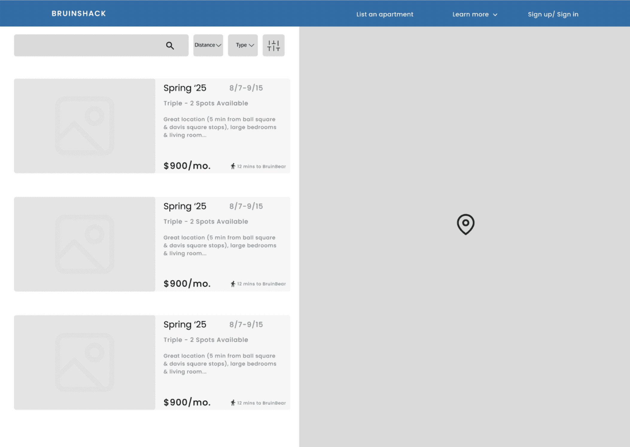
🖊️ Wireframe Version 1 Notes
focuses on structuring the sublet listing layout so users can quickly scan for relevant details
includes a list-view layout with basic information but needs more polished UI.
at this stage, I was testing how students interact with the listings and what information they prioritize.
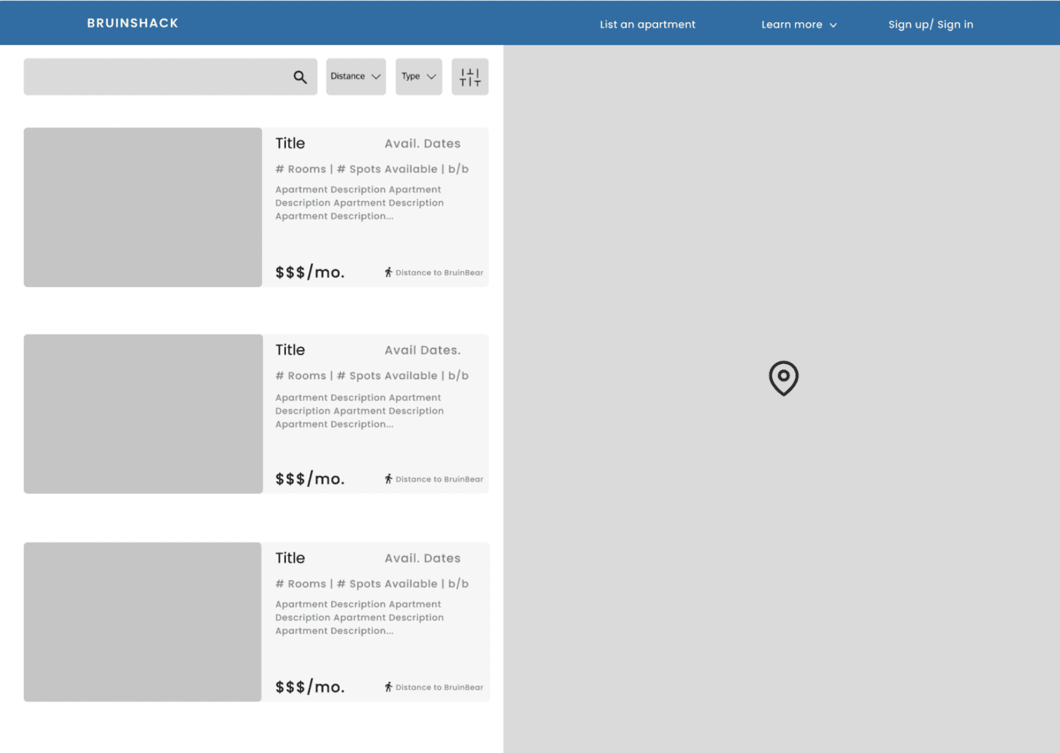
🖊️ Wireframe Version 2 Notes
introduces information in different formats (e.g. availability dates, room type, etc.)
adjusted text hierarchy to emphasize price and availability more clearly.
aims for clearer, more scannable UI but needs clearer room type display
🖊️ Wireframe Version 3 Notes
offering a variation of information hierarchy to prioritize key information
adjusted spacing and typography to make it easier to scan listings at a glance.
a bit scattered, could use more centralized hierarchy of the info.
🖊️ Final Wireframe Notes
offering a variation of information hierarchy in a clearer layout
adjusted spacing and typography and information hierarchy to make it easier to scan listings at a glance.


To create a student-friendly sublet feature, I analyzed:
Competitor Platforms: Facebook, Apartments.com, and Sublet.com.
User Feedback: Surveys and one-on-one interviews with our users highlighting trust and searchability as key concerns.
Here is what I found:
Trust was a major barrier. Students wanted verified listings to avoid scams.
Search experience needed improvements. Filters for price, location, and lease duration were a priority.
Sublet listings had to be seamless. A fast, simple listing process was essential to get more students to participate.